How to Improve the End-to-End User Experience

The term user experience involves all aspects of the end user’s interaction with your company, its products and any related services. As well as catering for business goals, good UX will focus on developing a deeper understanding of what your users need, value and want. In this way, you can improve the quality of their interaction with and the perception of your product. In other words, improve the user experience for your customer by ensuring that the information you provide is useful, desirable, usable, findable, credible and accessible. Here are four ways to improve the end-user experience for your business.
What is an end-user experience (UX)?
The end-user experiences (UX) is the value that brands provide to their users in the digital world through their products or services. This UX value can not only increase brand loyalty but also your brand’s ROI. Brands can improve user experience by assessing the accessibility and relevance of their content, the usability of their visual and navigational design as well as the various ways they can instil trust. Good end-user experience also needs to take account of continual user feedback so that a business can keep up with a user’s needs.
4 user experience improvement tips
Be consistent and accessible
For users to become loyal to your product or service, you need to make sure that your design, brand, identity, and its image is in line with what they desire. To give your user a beautiful experience as they navigate through your various online channels, they need to know that they are still experiencing your brand. So, your text, tone, language, design and colours all need to match. In this way, a user could seamlessly navigate from your website to a mobile app without feeling confused.
Create brand guidelines that pay attention to typography, logos, image resolution and a colour scheme. For example, GymIt, a Boston-based gym keeps working out simple by taking it back to its roots. It’s language, design, text, tone and colours is to-the-point and straightforward; it will only charge you for working out without the frills such as ‘designer protein shakes.’ It doesn’t take itself too seriously, which can make it a win-win situation for the average person who finds fitness centres intimidating.

On the other hand, bank Wells Fargo makes sure that its copy and designs are in line with its motto ‘Together we’ll go far’. Its messaging is rooted in family and building relationships which, works for its customers who always want to be put first.

You also want your brand to be accessible to those who are visually impaired. Apple has a good accessible design as its minimalist design makes everything easier to read. While they do use colour to accentuate their products, they improve user experience by combining their range of colours with a range of headings and short snippets of descriptions. It also has several eye-catching calls to actions so that the user knows exactly where to find information.

Establish credibility with content and testimonials
Informative, well-researched content not only boosts your credibility as an expert. It also tells the user that you are willing to be of service to customers as you will provide a helpful resource on a topic.
Make UX improvements by producing content in the form of blog posts, guides, checklists or quizzes. The most crucial facet of any good content is to solve your target audience’s problem for free so that eventually they will consider making a purchase. Before putting out any content, a business needs to make sure that:
- Headings and content are driven by what a customer needs. Include keywords in your title to make sure that your users find your content in their search engine.
- Sub-headings include relevant keywords to make it easier for users to find what they need.
- All pages have a meta-description which is also keyword-rich. This feature will encourage users to click on your page.
- The ‘alternative text’ field is used to tag your image with relevant keywords.
- There are links to external sources of authoritative content as well as older blog posts as you write new material.
- Posts that are on page two of the search engine are updated. This can be done by adding something new to it like video, expert quotes, a quiz or a guidebook.

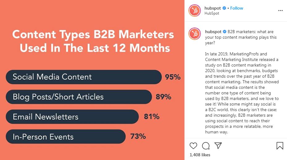
When many think of good long-form content, they think of HubSpot. In addition to its in-depth blog posts, it also improves the user experience for the customer through content upgrades. These include ebooks, informational videos on Facebook, free content marketing certifications and an educational hub called Inbound.org.

Brands like Rolex have also demonstrated that great content can also be about enticing images. Alternatively, sleep experience brand Casper uses YouTube to share the enthusiasm for its product unboxing.

Don’t forget that users also value trust. In addition to useful content, potential customers are more likely to buy from your brand if they see testimonials or recommendations from previous customers. Put these on individual pages like your homepage, product pages or other types of sales pages rather than setting up a separate testimonial page.
Instil more trust in your brand by showcasing the individuals who make your company great. Focus on the position they hold and what they are currently doing. Introducing your team to new users in this way will make them feel like they want to be part of this organisation. Improve user experience by using your team to build a narrative and opt for their real photos instead of stock photos. Share videos and images of how your team gets together in their spare time.

Looking for an example of a brand that has used their testimonials well? Check out Codeacademy who, through the section on their website called ‘Codeacademy Stories’, use videos with individuals who other users can relate to, creating authenticity and transparency.

Additionally, Glossier enhances their UX improvements by showing you how real people use their products. This feature encourages users to create a look which gets featured on their website within their ‘Shop the Look’ section. Other customers also have an opportunity to recreate that look then.

Ensure your navigation avoids friction
A user needs to understand your online content and consume it quickly. In other words, to improve UX for your website or app, deliver content in a clear, simple way which means that a business should:
- Avoid a complicated menu as this will make users feel overwhelmed. If you need to, create a secondary navigation menu for additional pages that you also want users to see.
- Get straight to the point for longer blog posts by putting in a menu of links that allow users to go to the section they need to.
- Improve the load time of your website initially conducting a speed test of your website and then compressing the images that you will use before using them on your site or app. Plugins like WP Super Cache will also ensure that visitors to your site will have a faster user experience.
- Get rid of any 404 error pages you have on your app or website by setting up Google webmaster tools to check for any crawl errors but if you do miss a 404 page allow it to have an option to take users back to your content.
- Fix broken links on your pages and allow an onsite search functionality to enable users to find information quicker
- Create forms that are simpler to fill in whether they are for your newsletter or your checkout process. Do this by making sure that error messages are near specific fields rather than the bottom of the page and by clearly stating which fields are mandatory and which are optional. Also, create a call to action that stands out, is written with urgency and is placed clearly so that your users see it when they scroll through your site or mobile app.
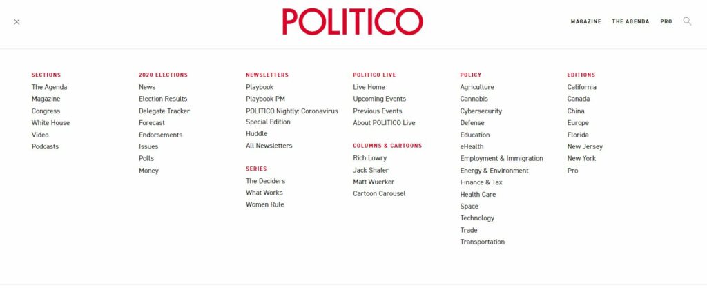
 Navigation design cannot be easy when you have lots of content you want your audience to access. But Politico makes this process more comfortable with their expandable menu that has clear categories and directs a user to the essential part of their website.

Brands such as Waterstones also improve user experience by making it easier to navigate through its Auto Suggest feature for its search bar.

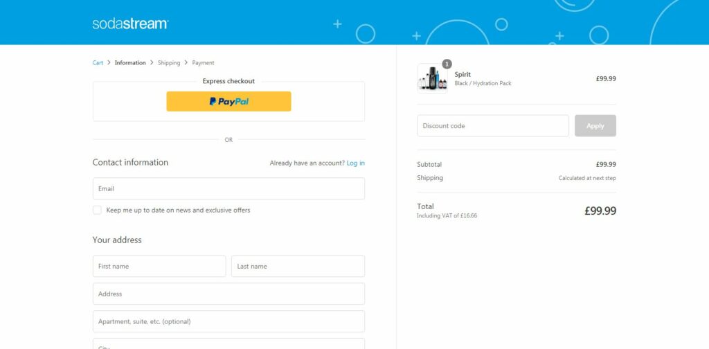
Likewise, Sodastream makes it easier to checkout with clear basket summary and definite steps towards payment.

Test and analyse to improve user experience
If you want to improve your user experience continually, you need to test user behaviour. Your website or mobile app needs to serve the needs of your users and to find out whether you do cater to their requirements. You need to ask them to do this by:
- Conducting moderated or unmoderated testing to find out what value your users can get from your website or app. You can also use the results from initial moderated or unmoderated interviews to further segment users into categories so you could develop specific campaigns that target their unique needs.
- You could also ask for feedback through surveys, chatbots or online polls through social media. This type of feedback could help you decide on any new features or products so that you could add further value to your user’s life.
- Adopt A/B testing to decide on the ideal CTA button size, CTA headline text, length of content on a page or contact form fields.
- Use a user testing software to track what your users do on your site or mobile app. Use heat maps and scroll maps to find out where users click, when they leave a page and what aspect of your page is not converting them into buyers.
 To continually improve their user experience, Mozilla got its customers directly involved in redesigning their entire system for Firefox. Users were given two versions of a design system and then had to vote for their favourite one. Not only did this improve brand loyalty, but it also enhanced transparency. Airbnb has also created a design that puts its users first by making it easy for both hosts and renters to use the same platform.

Giving your users the best user experience is making your product or service more user-centric. In other words, improve the user experience for the customer by focusing on the user’s journey and eliminating all of the frustrations along the way. Start by writing compelling copy and producing a great design to drive the user towards conversion. Then, analysing and testing your product or service will ensure the long-term success of your end-user experience. Book a demo with PlaybookUX today to discover how we can aid your success.
Speak to high quality people
